대회 정보
Costa Rican Household Poverty Level Prediction | Kaggle
www.kaggle.com
노트북 정보
A Complete Introduction and Walkthrough
Explore and run machine learning code with Kaggle Notebooks | Using data from Costa Rican Household Poverty Level Prediction
www.kaggle.com
Introduction
대회 소개
많은 사회적 프로그램 또는 기관들은 빈곤한 사람들이 충분한 도움을 받고 있는지 확인하는 데 어려움이 있다. 그 이유는 빈곤한 사람들은 그들이 지원을 받을 자격이 있다는 걸 증명할 수 있는 것들이 없기 때문이다. 예를 들면 수입이라던지 지출 내역등을 말할 수 있다.
라틴 아메리카에서는 이들의 소득 자격을 확인할 수 있는 PMT(Proxy Means Test)라는 방법을 사용하는데 사람들이 살고 있는 집의 벽지, 천장의 재료 등과 같은 것들을 고려하여 그들의 수준을 예측하는 방법이다. 하지만 이 방법도 인구가 증가함에 따라서 여전히 문제로 남아 있어 캐글을 통해 해결책을 얻고자 대회를 개최하였다.
데이터 소개
train set에는 9557개의 row와 143개의 column이 있으며
test set에는 23856개의 row와 142개의 column이 있다.
각 row는 개인 또는 대한 자산 특징을 나타내며 Target은 개인의 빈곤 수준을 1~4의 값으로 나타낸다. 여기서 1이 가장 극심한 빈곤 수준이다.
Id - 각 행(개인)의 고유식별자
Target - 개인의 빈곤 수준 (1: 극빈, 2: 적당한 빈곤, 3: 취약계층 가구, 4: 비취약 가구)
idhogar - 각 가구에 대한 고유 식별자
parentesco1 - 이 사람이 가장인지에 대한 여부
이외의 자산 특징을 나타내는 139개의 column들이 있는데 너무 많으므로 설명은 생략하겠다.
Problem
- Supervised: Train set이 주어지기 때문에 지도 학습 문제이다.
- Multi-class classification: Target 클래스의 값이 총 4개이기 때문에 다중 분류 문제이다.
Objective
빈곤을 개인이 아닌 가구 단위로 예측하는 것이 이 노트북의 목적이다.
주의사항 : 동일한 가구의 개인은 서로 다른 데이터를 가지고 있는 경우가 있으며 이 경우에는 가장의 데이터를 사용하도록 한다. 일부 개인들은 가장이 없는 가구에 속해있으며 안타깝게도 이 경우는 이 노트북에서 사용하지 않는다.
Roadmap
- Understand the problem
- Exploratory Data Analysis
- Feature engineering to create a dataset for machine learning
- Compare several baseline machine learning models
- Try more complex machine learning models
- Optimize the selected model
- Investigate model predictions in context of problem
- Draw conclusions and lay out next steps
Getting Started
Imports
# Data manipulation
import pandas as pd
import numpy as np

# Visualization
import matplotlib.pyplot as plt
import seaborn as sns

# set a few plotting defaults
%matplotlib inline
plt.style.use('fivethirtyeight')
plt.rcParams['font.size'] = 18
plt.rcParams['patch.edgecolor'] = 'k'
여기서 patch.edgecolor를 'k'로 설정해주었는데 이는 patch의 모서리 색상을 black으로 설정하겠다는 뜻이고 원래 default 값이 black이기 때문에 굳이 해줄 필요는 없다.
Read in Data and Loot at Summary Information
pd.options.display.max_columns=150

# Read in data
train = pd.read_csv(data_dir + '/train.csv')
test = pd.read_csv(data_dir + '/test.csv')
train.head()
column이 굉장히 많다보니 모든 column들을 확인하기 위해 pd.options.display.max_columns를 150으로 설정하였다.
train.info()
test.info()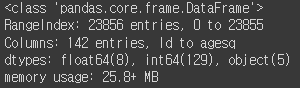
df.info()를 통해 확인해본 결과 float형 변수는 8개, int형 변수는 130개, object 변수는 5개임을 확인할 수 있다. test.info에는 Target이 빠져있기 때문에 int형 변수가 129개이다.
Integer Columns
train.select_dtypes(np.int64).nunique().value_counts().sort_index().plot.bar(color='blue', figsize=(8, 6), edgecolor='k', linewidth=2)
plt.xlabel('Number of Unique Values')
plt.ylabel('Count')
plt.title('Count of Unique Values in Integer Columns')- nunique 함수는 각 column마다 고유값이 몇 개 있는지 개수를 확인하는 함수이다.

- value_counts 함수를 통해 이 값들의 개수를 파악할 수 있다.
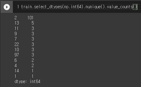
- 여기서 edgecolor를 black으로 주면서 각 막대에 edge가 생겼다.

각 column에 고유값이 2개인 경우가 많은데 이것은 Boolean Type(True or False)일 가능성이 높다. 예를 들면 개인이 살고 있는 가구에 냉장고가 있는지 없는지, TV가 있는지 없는지 등의 특징을 말할 수 있다.
Float Columns
연속 변수(Continuous Features)를 나타내는 Float Columns의 분포도를 확인해보자.
from collections import OrderedDict

plt.figure(figsize=(20, 16))
plt.style.use('fivethirtyeight')

# Color mapping
colors = OrderedDict({1: 'red', 2: 'orange', 3: 'blue', 4: 'green'})
poverty_mapping = OrderedDict({1: 'extreme', 2: 'moderate', 3: 'vulnerable', 4: 'non vulnerable'})

# Iterate through the float columns
for i, col in enumerate(train.select_dtypes('float')):
    ax = plt.subplot(4, 2, i + 1)

    # Iterate through the poverty levels
    for poverty_level, color in colors.items():
        # plot each poverty level as a separate line
        sns.kdeplot(train.loc[train['Target'] == poverty_level, col].dropna(), ax=ax, color=color, label=poverty_mapping[poverty_level])

    plt.title(f'{col.capitalize()} Distribution')
    plt.xlabel(f'{col}')
    plt.ylabel('Density')

plt.subplots_adjust(top=2)
red: 극빈, orange: 적당한 빈곤, blue: 취약계층 가구, green: 비취약 가구
- sns.kdeplot을 사용하여 밀도 분포를 그릴 수 있다.
- capitalize는 각 단어의 첫 글자를 대문자로, 나머지를 소문자로 바꿔준다.
- plt.subplots_adjust를 통해 subplot들간의 크기와 간격을 조정할 수 있다.
각 float column들을 살펴보면 다음과 같다.
- v2a1 : 납부 해야 할 월세
- v18q1 : 가구가 소유하고 있는 태블릿의 수
- rez_esc : Years behind in school (무엇을 의미하는건지 잘 모르겠다.)
- meaneduc : 성인 평균 교육 기간
- overcrowding : person per room (room당 인원 수)
- SQBovercrowding : overcrowding 제곱
- SQBdependency : dependency 제곱 (dependency = (19세 미만 또는 64세 이상 가구원 수) / (19세 이상 64세 미만 가구원 수))
- SQBmeaned : meaned 제곱 (가구 내 성인 평균 교육 연수 제곱)
Object Columns
train.select_dtypes('object').head()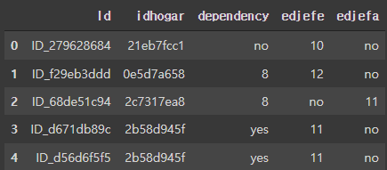
id와 idhogar는 개인과 가구를 식별하는 변수이기 떄문에 그대로 둔다.
하지만 dependency와 edjefe, edjefa는 yes와 no라는 값들이 포함되어 있는 것을 볼 수 있다.
- edjefe : 남성 가장의 교육연수
- edjefa : 여성 가장의 교육 연수
이 노트북에서는 yes를 1, no를 0의 값으로 mapping하여 사용하고자 한다.
mapping = {"yes": 1, "no": 0}

# Apply same operation to both train and teset
for df in [train, test]:
    # Fill in the values with the correct mapping
    df['dependency'] = df['dependency'].replace(mapping).astype(np.float64)
    df['edjefa'] = df['edjefa'].replace(mapping).astype(np.float64)
    df['edjefe'] = df['edjefe'].replace(mapping).astype(np.float64)

train[['dependency', 'edjefa', 'edjefe']].describe()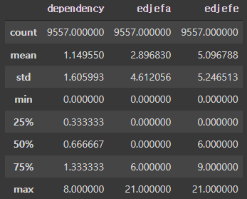
- df.astype으로 데이터프레임의 data type을 변경할 수 있다.
plt.figure(figsize=(16, 12))

# Iterate through the float columns
for i, col in enumerate(['dependency', 'edjefa', 'edjefe']):
    ax = plt.subplot(3, 1, i + 1)
    # Iterate through the poverty levels
    for poverty_level, color in colors.items():
        sns.kdeplot(train.loc[train['Target'] == poverty_level, col].dropna(), ax=ax, color=color, label=poverty_mapping[poverty_level])

    plt.title(f'{col.capitalize()} Distribution')
    plt.xlabel(f'{col}')
    plt.ylabel('Density')

plt.subplots_adjust(top=2)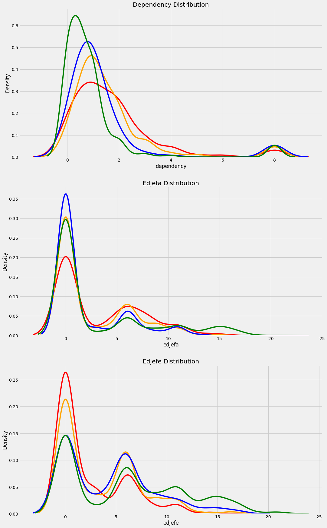
red: 극빈, orange: 적당한 빈곤, blue: 취약계층 가구, green: 비취약 가구
float 변수들과 동일한 방법으로 분포를 확인해보았다.
# Add null Target column to test
test['Target'] = np.nan
data = train.append(test, ignore_index=True)
train set과 test set을 data에 합쳐주었다.
Exploring Label Distribution
# Heads of household
heads = data.loc[data['parentesco1'] == 1].copy()

# Labels for training
train_labels = data.loc[(data['Target'].notnull()) & (data['parentesco1'] == 1), ['Target', 'idhogar']]

# Value counts of target
label_counts = train_labels['Target'].value_counts().sort_index()

# Bar plot of occurences of each labels
label_counts.plot.bar(figsize=(8, 6), color=colors.values(), edgecolor='k', linewidth=2)

# Formatting
plt.xlabel('Poverty Level')
plt.ylabel('Count')
plt.xticks([x - 1 for x in poverty_mapping.keys()], list(poverty_mapping.values()), rotation=60)
plt.title('Poverty Level Breakdown')

label_counts
- heads 변수에 가장들의 데이터만 따로 분류했지만 이 부분에서는 사용하지 않는다.
- train_labels 변수에 Target이 비어있지 않으면서(비어있는 경우가 없다.) 가장인 데이터를 Target, idhogar 열만 뽑아낸다.
- xticks에 rotation 옵션을 주어 눈금을 회전시킬 수 있다.
Target의 데이터 분포를 살펴보면 비취약 가구의 비중이 월등히 높아 데이터가 불균형하다고 해석할 수 있다.
불균형한 클래스를 해결하기 위해 SMOTE와 같은 오버 샘플링을 사용하는 방법이 있지만 여기서는 다루지 않을 것이다.
Addressing Wrong Labels
Identify Errors
(~ing)
'Data Science > Kaggle' 카테고리의 다른 글
| [캐글 필사] EDA To Prediction (DieTanic) (0) | 2022.02.09 |
|---|